Kerning in Typography: Why It Matters
Typography plays a crucial role in design, influencing how information is perceived and understood. One of the most overlooked yet powerful aspects of typography is kerning—the adjustment of space between characters.


In today’s era of minimalist design, where clean aesthetics dominate, understanding kerning can significantly enhance the visual appeal of your designs. Let’s explore why kerning is essential and how it can impact the readability and effectiveness of your work.
What is Kerning?
Kerning refers to the spacing between individual letters in a word. It is different from tracking, which adjusts the spacing uniformly across a group of letters. Proper kerning ensures that text appears visually balanced and easy to read, preventing awkward gaps or overcrowding that can make words look disjointed or confusing.
Why is Kerning Important?
- Enhances Readability
Poor kerning can make text difficult to read. Letters that are too close together or too far apart can create confusion and reduce legibility. - Improves Aesthetic Appeal
Well-kerned typography gives a polished and professional look, making the text visually pleasing and harmonious. - Prevents Misinterpretation
Bad kerning can unintentionally alter the meaning of words, leading to humorous—or sometimes embarrassing—misinterpretations. - Elevates Brand Identity
Consistent and well-spaced typography strengthens branding and ensures that logos, headlines, and marketing materials look refined.
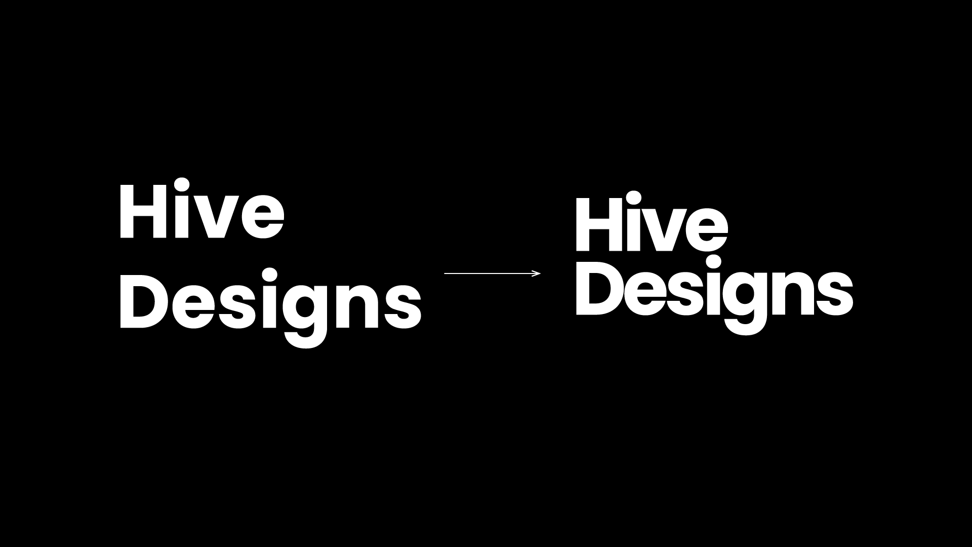
Kerning in Action: A Simple Example
Imagine a logo or a headline with default kerning—it may appear uneven or slightly off. By adjusting the kerning, you can achieve a cleaner and more structured look. However, it’s important to strike a balance. Too much kerning creates excessive gaps, while too little makes text cramped and unreadable.
A well-designed piece should feel seamless, where the viewer doesn’t consciously notice the kerning but subconsciously appreciates the clean layout.
Best Practices for Kerning
- Always Check Readability: If adjusting kerning, ensure that words remain clear and easy to read.
- Test with Different Fonts: Some fonts require more kerning adjustments than others. Always experiment.
- Use Manual Adjustments: While many design tools provide automatic kerning, manually refining letter spacing often yields better results.
- Look at the Overall Composition: Kerning should complement the entire layout, not just individual words.
Final Thoughts
Kerning may seem like a small detail, but it has a big impact on the quality of a design. Whether you’re working on logos, branding, or web design, mastering kerning can take your typography to the next level.
Next time you design something, take a moment to check the kerning—because in the world of design, the smallest details make the biggest difference.
Have you ever noticed bad kerning in a design? Share your thoughts and experiences in the comments below!